Publication Design — Agency: Michael Marshall Design
Reporting with Style
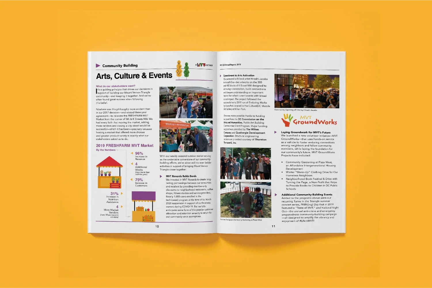
An annual report catered to the neighborhood. Through saturated color, abstract geometry, and people-first storytelling, we created a vibrant print piece that captured the spirit of the Mount Vernon Triangle community.
Project Highlights:
Directed the concept, layout, and production of a community-facing annual report
Oversaw a 4-person team and coordinated with external print vendors
Infused data reporting with neighborhood storytelling and lifestyle photography
Redesigned a district map that became a recurring asset in future publications
Led to 5 additional engagements, including another annual report, totaling over $18K in revenue
-
Mount Vernon Triangle Community Improvement District (CID), a nonprofit organization supporting economic development, cleanliness, and community vitality in the heart of Washington, D.C.
-
Client Stakeholders, Creative Director, Creative Services Director, two Senior Graphic Designers, Copy Editor, Photographer, Print Vendor
-
Refresh and redesign the CID’s annual report to better reflect the community’s diversity and energy
Balance reporting with visual storytelling and human-centric narrative
Develop flexible layouts that could support future use and iteration
Deliver annual report to community members and board members
-
Led creative direction and execution across layout and illustration
Managed project milestones, internal reviews, and final file preparation for production
Coordinated directly with print vendors on formatting, proofs, and delivery timeline
Collaborated with editorial and photography teams to align visual and verbal storytelling
Delivered final report ahead of schedule
-
At project kick-off, the CID shared a desire to get away from the typical financial-report format and instead produce something more people-focused. Their goal: connect with residents, celebrate small businesses, and convey impact through a human lens.
In response, we advised shifting the editorial toward neighborhood stories and high-quality visuals. We coordinated a photo shoot to capture real residents and local businesses, creating a stronger emotional connection with the audience. Our copy editor revised formal sections of the report to introduce more engaging, community-forward language.
On the design side, we built the visual system around the CID’s signature triangle motif, using geometric overlays, vibrant color, and bold typography to structure information and drive visual interest. The combination of full-spread images and financial data ensured an balance between story and substance. A new fold-out district map became a standout feature and has since been updated annually.
-
Report was completed and printed ahead of schedule
Successfully repositioned the CID’s communications strategy toward a more resident-centric voice
Select assets—such as the community map—have been repurposed in subsequent reports and placemaking campaigns
Ongoing partnership with the CID led to additional work across digital collateral and publication design